Brand identity
Hortifruti
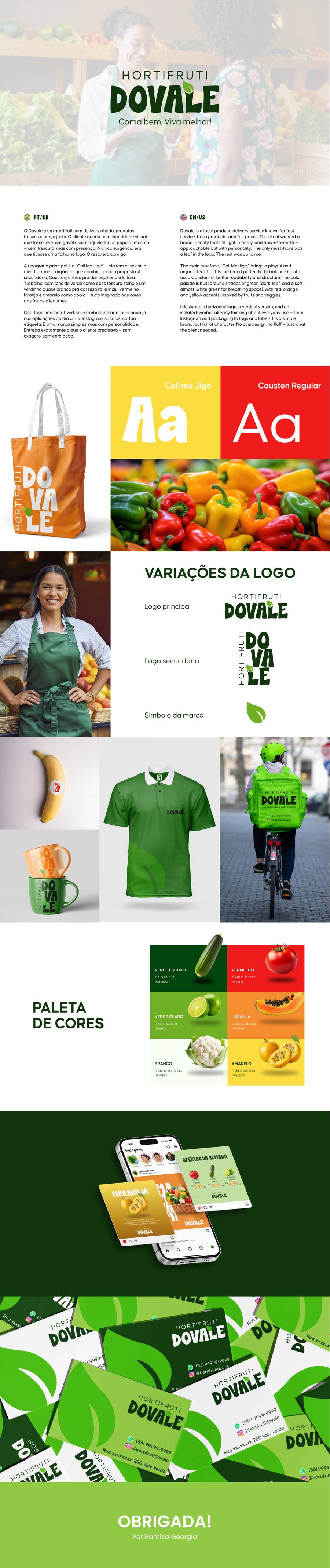
Brand identity with primary logo, secondary logo and symbol.
The brand starts from the concept “Eat well. Live better!”. I created the primary logo, the secondary logo and the symbol, with a palette in shades of green and a rounder typeface, so the produce store feels close to its customers.
- Primary logo
- Secondary logo
- Symbol
- Palette and typography
Scroll inside the window to see the whole presentation.
Next projectMayra Costa — Molde F1